So today I get a solicitation from another real estate company, wanting me to leave my broker and join their team. This happens from time to time, especially towards the end of the year when people are more likely to be “friendly.”
I typically just scan the message and click the little garbage can icon to send those digital bits to the great beyond. As I read this particular email, one line stuck out for me.
CENTURY 21 is the most recognized consumer Real Estate Brand in the country!
I was a little surprised. Here in Louisville, REMAX is the largest and most recognized brand in real estate. But after doing some digging around, sure enough, Millward Brown (the 2nd largest market research firm behind Nielsen, who knew) did a survey in 2013 that proved these results. (Editor: Millward Brown is now Kantar.)
Interesting, to say the least. Then a thought occurred to me. “I bet the good ole Positioning: The Battle for Your Mind is at work here.”
Comparing Real Estate Company Logos
Coming from a graphic design/branding background, I have a great deal of experience in logo design. I was curious about their logo and marketing materials, such as websites, flyers, etc. so I began a quest. A quest to check out all these real estate logos. I’m such a nerd.
Here’s the Century21 logo I found prominently placed in the upper left hand of their website.

and there’s the one REMAX currently using.

Size differences aside, what do you notice? Is there anything about either one that gives you a clue as to what business they are in?
Even though Century21 began in 1971, they are trying to push a more advanced, futuristic image by identifying themselves the time period starting in 2001. Of course, just being associated with the 21st century doesn’t say a single thing about real estate.
Thus the little house they’ve uncomfortably wedged into their logo.
What about the other players in this space? Does Keller-Williams, whose logo just has just recently changed, have any real estate identification? Nope.

What the real estate company that sounds more like an investment firm—Coldwell-Banker? Not at all.

The most service unspecific brand of all, Sotheby’s, has multiple logos. With seven service businesses centered around the art world, having a real estate brand feels quite detached. Does it at least have a real estate mnemonic? Nada.

But they did spell it out for us. Thanks! I guess.
Our search finally brings us to another worthwhile example. Good ole ERA (which stands for many things, real estate falling down to the middle of the list) has recently revealed a new logo themselves.
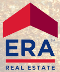
Want to see it? Of course, you do! Here’s the ERA logo that’s currently playing on their website.

They are committing a branding no-no by allowing strange colors to enter into the logo space but at least we see a glimpse of what kind of business these people are in.
That’s a roof, right? Not a bullet or rocket ship or anything… Ok, I think we’re good.
(Full disclosure: The older, less attractive, ERA logo also had a house as part of the design but I’m all about being current up in here.)
REMAX Logo Improved
So that brings us to REMAX. Could it be spelled Remax? ReMax? How about RE/MAX? It’s all so confusing. Can we at least improve the logo?
I wager that 101 graphic design courses could result in a couple of dozen logo designs all better than what REMAX is currently using but I wanted to give it a shot myself.
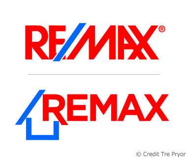
Here’s what I created in less than an hour. The current REMAX logo is the one on top, for your reference.

What do you think? Maintains the current color scheme, general font characteristics but re-purposes the odd forward slash into a cute but recognizable home.
It may not be the best possible choice, but if you want to be the most recognized brand in real estate, enhancing the most seen aspect of your company is the first place to start.
Hey REMAX, for a very reasonable fee I’ll sell you my design. Hit me up!


