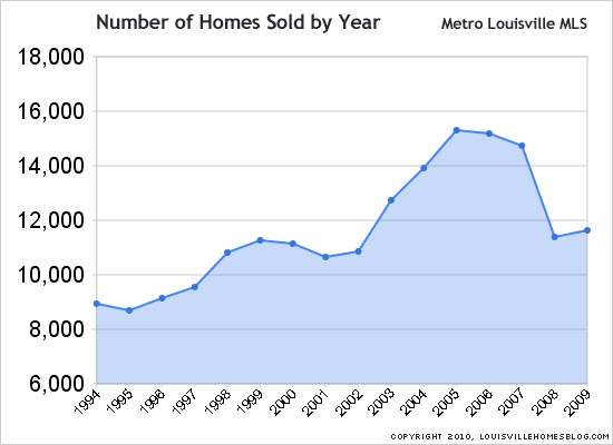
Putting data into chart form almost always communicates better than simply reading the data. For example, looking at the chart above that shows the total number of homes sold by year in Louisville, KY.

It’s clear that 2008 and 2009 have been tremendously down years when compared to the previous five. But look back to the levels of the late 90’s and early 00’s and they are right in line. Interesting.
Ivan Turgenev would have been proud. He originally authored, “A picture shows me at a glance what it takes dozens of pages of a book to expound.”


