Over the years I’ve written a whole slew of Top 10 articles, several hitting on good home design, such as these:
- Top 10 Ways to Prepare Your Louisville Home For Sale
- Top 10 Pro Staging Tips for Louisville Homesellers
- Trends in new construction and interior design on display at the upcoming Homearama 2012 (Since removed)
But I’ve never posted on what not to do. Bad home design mistakes are everywhere! Believe me, I see it on a daily basis when I’m out showing my clients homes in Louisville. So let’s have some fun and talk about the worst of the worst. From the more common design mistakes to the ones that really make you cringe.
Case in point:
First time ever! His and hers toilets! pic.twitter.com/BFj2uaOnd1
— Tre Pryor, Realtor (@TrePryor) August 30, 2013
Sure, it’s more subjective but really?
This is what can happen when you don’t use a professional #Designer when select paint colors. Yikes! pic.twitter.com/Gk9ut00fYO
— Tre Pryor, Realtor (@TrePryor) May 9, 2014
Instead, we’re talking about examples of bad home design mistakes that really shouldn’t be part of anyone’s home.
Top 10 Bad Home Design Mistakes
Ok, let’s count them down from #10 to the very worst, #1 home design mistake. Let’s go!
#10 Two-story Great Rooms
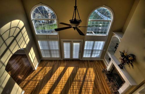
Listen, I know many will argue with me about this but from a home design perspective, you’re wasting a great deal of space. Not to mention additional heating/cooling costs, all for what? So that you can feel like you live in a mansion?
This is a trend that’s on the way out, thank heavens.
#9 Popcorn or Textured Ceilings
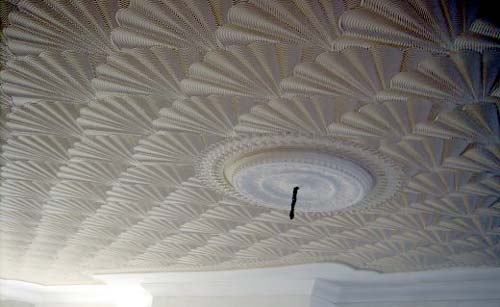
Rosebud Stomp, Hawk and Trowel or *shudder* Popcorn textured ceilings are something that should never have happened. I mean, who came up with this? I think we can all agree it was a bad idea. Smooth, white, classic… that’s what ceilings should be.
#8 Theme Rooms
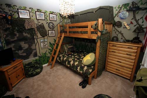
Most often, these rooms are done by self-styled “designers” who also happen to be one of the home’s owners. True designers don’t go there. And you shouldn’t either! Friends, help each other.
#7 Unnecessary “Luxury” Upgrades
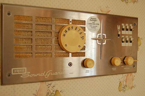
Just because the technology exists, doesn’t make it a great idea. Do you really need a whole house vacuum system? What about the intercoms slash radios slash Internet-device slash whatever else you can throw in there? More often than not, these expensive luxury upgrades aren’t worth the money you pay for them.
#6 Faux Wall Treatments
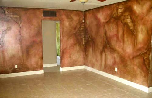
Listen, we all love the look of real, natural stone. It’s gorgeous! Who wouldn’t want it inside your home? The answer is, “None of us.”
But the correct way to get the look of real stone is with… real stone. Or at least the new artificial stone that actually looks real. Definitely not paint, not now, not ever.
#5 Giant Exterior Columns
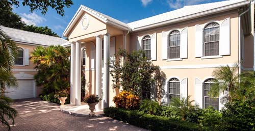
Let’s face facts, you don’t live in the White House, the Lincoln Memorial or the Parthenon. Nobody needs to see giant columns attached to the front of your two-story colonials. You’re not fooling anyone. Let’s just tone it down a bit and we’ll all get along better.
#4 Carpet in Bathrooms
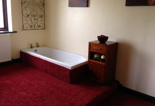
The only good thing about this bad home design mistake is that it’s easily fixed. *shudder* Let’s move on.
#3 Wrong-Sized Rooms for Their Purpose
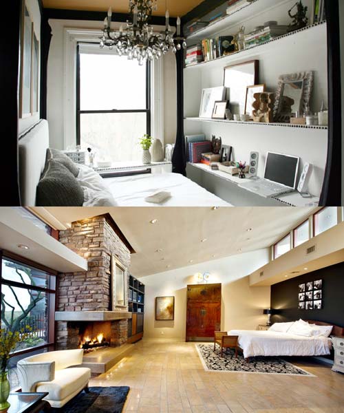
Human beings are diverse. We all don’t like the same things. Even still… there are extremes at either end of the spectrum where space is either desperately needed or overtly wasted. Good home design doesn’t make this mistake.
#2 Statement Pieces that Make the Wrong Statement
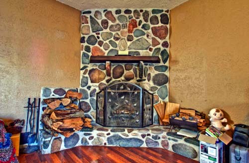
Whereas removing carpet from a bathroom is a simple affair, the cost of removing some statement pieces from an otherwise nice home may be cost-prohibitive. I’ve seen homes where just a few “over the top” home design features were enough to send the buyers running.
#1 Almost Zero Storage
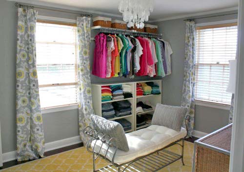
Now, more than ever, we need places to put our stuff. If your home doesn’t have adequate storage, you know what I’m talking about. It’s maddening!
Older homes by nature have smaller closets and many times fewer closets. Modern homes have no excuse. Homes without storage are losers, plain and simple.
Conclusion
So there you have it. Friend, don’t let your friends make these bad home design mistakes. The world is scary enough as it is.


