After the show, I published a piece for InsiderLouisville.com titled Homearama 2013 Wrap-Up: Less Extravagance, More Balance and Traditional Quality. Here, I’d like to expand on the topic and present more photos. Photos beat copy any day, right?
Exterior Photographs of Homearama 2013 in Rock Springs, Louisville KY
Firstly, Rock Springs is a great development in Northeast Louisville, still within Jefferson County and just minutes from The Summit. (I refuse to call it Paddock Shops.)
The development is on a nice piece of property, gently rolling that affords a good number of fall-away home sites. The lots aren’t very large but that’s in keeping with local and national trends.
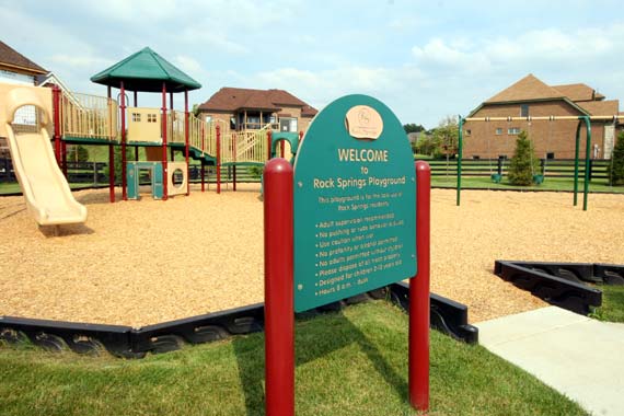
There were 10 homes built for this location of Homearama. For a complete run-down, feel free to hop over to the Home Builders Association of Louisville website for more.
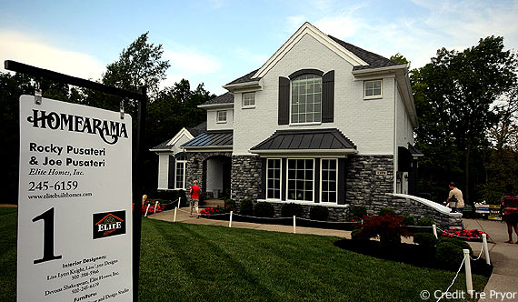
House #1 was built by Daryl Hardy. This well-done, yet functional house was one of my favorites, not because it looked like a lot of chances but because I could really see my clients living comfortably there.
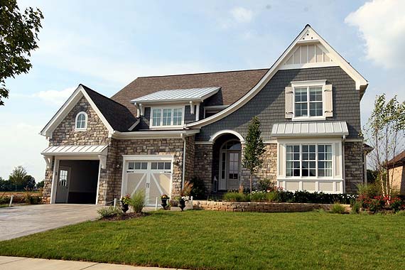
This is House #3 by Brandon & Rick Buttorff and it was my favorite. There’s a lot to like about this design and the builders’ quality was readily apparent.
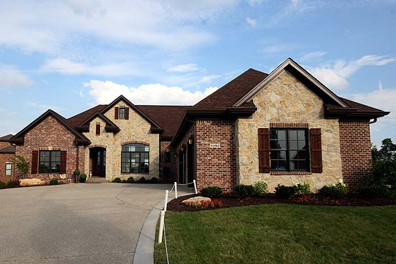
Built by Joe Kroll & Dan Swigart, this is House #7. Again, very sound decisions were made in both layout and materials. It was also well-staged with a compliment of modern with traditional finishes.
Great Room Photographs of Homearama 2013 in Rock Springs, Louisville
Now we’re moving inside! It’s clear that open floorplans, where the largest family space (often labeled the great room) needed to flow smoothly into the kitchen and eating areas.
This isn’t a new trend but one that has been even more solidified in the past 6-7 years.
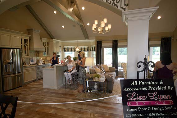
Here we see a super open kitchen, with nothing but a single post defining the dining room space. Lots of windows in the rear, as expected but perhaps the flooring choice rubbed some visitors the wrong way.
Homearama has always been a place where architects, builders, and designers try to make a statement. Lately, different ceiling treatments have grown more and more diverse. What do you think of this choice?
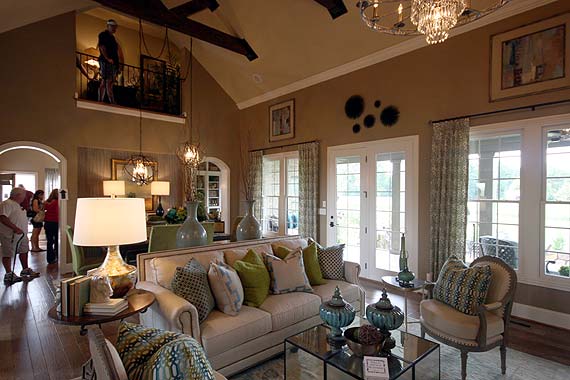
While not as open to the kitchen as some of the other layouts, this great room’s fully vaulted ceiling creates an immense feeling of spaciousness.
Novel Build Design Choices in Homearama 2013 in Rock Springs
I’m always on the lookout (and hopefully I didn’t miss any) for architectural design choices that I have not seen previously. (I’m rapidly passing through middle age so hopefully, I’m just not forgetting them.)
This year’s event didn’t show me as many as I had hoped but perhaps, that was due to builders’ change in priorities from “building a buzz” to “writing some contracts.”
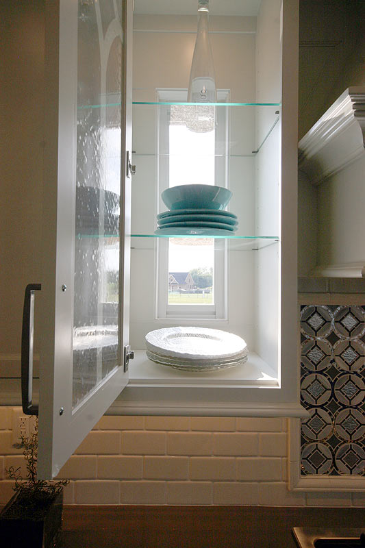
Question: How much do I love this trick?! Answer: Incredibly! These small windows were designed to fit nicely behind clear glassed kitchen cabinets so the light from outside comes all the way through into the kitchen. Clever!
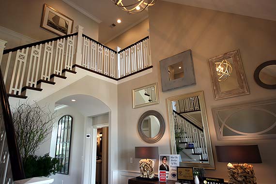
When everyone else is using the same black, wrought-iron, staircase spindles, try something new. I love these craftsman-styled spindles.
Interior Design Photographs of Homearama 2013 in Rock Springs, Louisville KY
We didn’t have any truly outrageous designs in this year’s Homearama, which may or may not be a good thing, depending on your predilection. So I’ll just hit on what I found.
While wallpaper also has a warm place in most designers’ hearts, homeowners haven’t been big fans of late.
Perhaps that trend is changing?
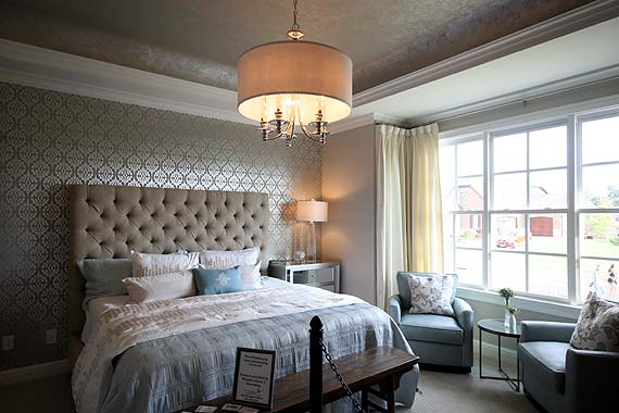
This photo actually makes the contrast higher than I remembered seeing it live. The metallic sheen was more subtle but truly classic in design and beautiful. The designers for this home were Karista Hannah and Lauren Harp.
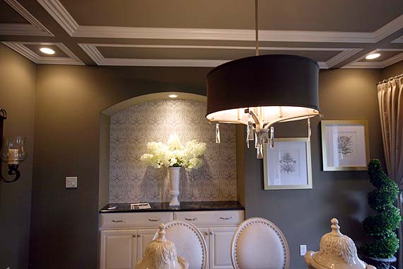
A very strategic use of wallpaper that comes off wonderfully was this formal dining room inset with wallpaper above and quality built-ins beneath. Designers: Ann M. Cloyd and Frankie Epperson.
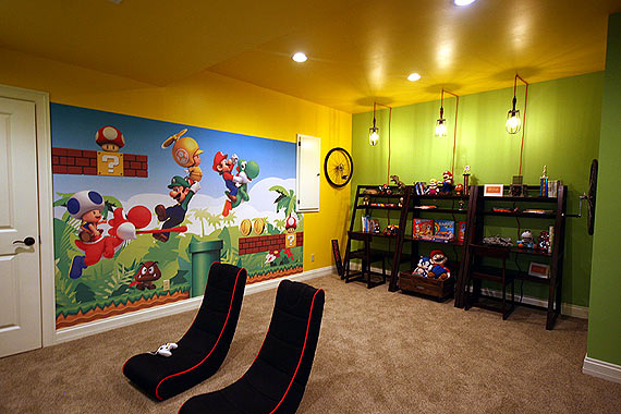
No Homearama would be complete without a fun kid’s room. This shot came from House #9 whose designers were Lisa Lynn Knight and Melissa Pierson.
Conclusion
Hope you enjoyed this Rock Springs Homearama feature! Feel free to share with friends. I would also love to hear your feedback, both good and bad.
Also, if you have any tips about stories you’d like to read in the future, I welcome them.



Pingback: 23 Excellent Game Room for Kids - Home, Family, Style and Art Ideas
Pingback: 23 Wonderful Game Room for Kids - Home, Family, Style and Art Ideas
Pingback: 23 Finest Kids Game Room Decor - Home, Decoration, Style and Art Ideas
Pingback: 23 Modern Game Room for Kids - Home, Decoration, Style and Art Ideas